
Cohapp
Cohapp was created with the intention to help couples who recently started living together.
When I started this project I wasn’t very familiar with this topic, but I was determined to discover more, so I embarked on a research journey that led me into empathizing and understanding common problem spaces couples face when living together.
One of my key learnings from this project is that every couple is different and the only two people that can understand the dynamic of the relationship are those living the relationship. This is why I wanted to create a solution that was highly customizable to each couple's needs.
Scroll down to learn more about the development of this project.

The Challenge:
Moving in together is usually the next big step in a relationship and a great way to deepen a couple's bond.. It can be both exciting and scary. Even though the aim is to share and spend more time together, the challenge is… that you will share and spend more time together. Living together will present its own set of unique challenges, from house chores, to splitting up costs, to finding alone time.

The Goal:
Cohapp will provide a sharing experience to couples who live together. From sharing notes to planning tasks and dividing the house work.
Because every couple has different needs,
Cohapp allows users to customize the options based on their preferences.

Secondary Research
The decision to get married or to move in with a partner is a personal one, but for most married and cohabiting adults, love and companionship are the main causes. Convenience, wanting to make a formal commitment, desire to have children in the future and finances are other common reasons of taking the step of moving together.
#1
Love and companionship is the main reason for couples to take the decision to move in together

30%
of people say messiness is the biggest annoyances of living with a partner

56%
of couples split up after
moving in with a partner
Assumptions
After some initial secondary research, I started writing down the things I assume about couples based on my own perception and the information gathered. I will then test this assumptions veracity by interviewing couples who recently move in together.
Hypothesis Statement
I believe that most couples who move in together don’t have a proper system of preparation in regards all the new changes that come when moving in together. I will know if I'm right if at least 2 out of the 3 people interviewed mentions lack of planning.
Interviews
Through a decontextualized method I proceeded to conduct interviews with three participants that recently (less than 2 years) move in with their partners. Through these interviews the goal was to understand couples experiences when living together and find common problem spaces that I could design potential solutions for and will allow couples to live healthier relationships when moving-in together.


Affinity Map
After categorizing all my participant findings into behaviors, motivations, and pain points I discovered various interesting common themes. The three that stood out more where :
1. Couples wanting to have better financial planning
2. Couples want a more efficient way to divide house tasks
3. Couples will like a tool where they can share information with each other
How might we help recently married and cohabiting couples better organize and share their to do’s so they can live more harmoniously?
I decided to focus on the theme about sharing information, since it could convey many themes into one. With the theme and insight in mind, I created a How might we question to help me refine the problem I will be creating a solution for.
Insight:
Living together is not only about sharing the space you live in, but many activities from buying groceries to planning trips, to scheduling appointments.
Couples will like to have a shared space to plan together, list the to do’s and remind each other
As they often find it hard to keep track of everything.
.png)
Persona
After reviewing all the insights from the interviews, I was able to create a primary persona that reflects the real people behind the interviews and represents the characteristics of a potential target user in terms of expectations, pain points, and needs, and how they would potentially use the product solution.

Experience Map
With the primary persona (Alexandra) in mind, I created an experience map of what her experience would look like when trying to set up a task plan for her and her partner using the App solution. Through this experience map I was able to identify potential opportunities.
Task Flow
.png)
Next, it was time to create a task flow of how the user will interact with the platform. In order to come up with the task flow I first wrote down a list of user stories that best represented what the user needs were. After a list of 25 user stories I began grouping them into epics for which I selected a final one.
Chosen epic: Sharing
Chosen User story: As a couple who recently move in together, we want to create a shared list of household tasks, so that we can both see what needs to be done.
.png)
Sketches:
After the task flow was completed I began translating the flow into sketches.
User will start in the home screen where through multiple access points will be able to proceed to the task screen. In the task screen they will tap on create plan which will take them to the plan set up screen. Here they will select their preferences based on start day, frequency, among others. After that they will continue to the task selection screen where they can add and edit tasks. Once the list is reviewed they will create the plan and tasks will be added to the calendar. When user completes a task they can check the box and receive a confirmation pop up with the amount of points received.

.png)
Mid Fidelity Prototype
After the initial sketches I used them to guide me on the next step of the process which was creating grayscale digital wireframes and interactive prototypes using Figma.
I began collecting the styles I wanted to include in the App, such as typography, gray scale colors, buttons, icons and images to help me create each screen more efficiently.
After my initial prototype I conducted my first round of usability testing with 5 individuals, whose feedback helped me make improvements to the design.
Usability testing
After the prototype was completed, I proceeded to create a first round of usability study to help me obtain feedback on how to improve the creating tasks experience on the App.
Through the usability study I tested 5 individuals who recently (less than 2 years) move in with partner. I gave them 6 tasks to be completed that were related to creating a task plan, setting up a reward and marking task as complete to earn points.
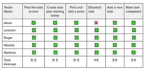
As a result of the first usability testing, all users were able to complete the tasks except for one, who found the deselect button to conflict with the x to delete task.
Even though the other testers completed this task this specific part of the experience was the one in which they must struggle and the design of the screen needed to be reevaluated.
Prioritization Matrix
After each usability study I collected my observations and feedback from the testers and created a prioritization matrix that helped me determine what changes to make. I concluded that the first six points were the most important ones to update, since more than one user mentioned something about it. While the last two were more of individual user preference, so I needed to gather more data before deciding to change it. I made a new revised version of the prototype with the changes made so that I could tested again with 5 new people.


Before
After

Before
After
Brand
Development
I began the brand development of the App by creating a mood board. So that I could have a base of the direction of the mood and feel of the app. In order to create the mood board I took the following steps:
-
Made a list of 20+ adjectives of what I wanted the user to feel when they use the App.
-
Divide the adjectives list into categories
-
Start selecting images that represent the adjectives chosen.


Using my chosen group of adjectives: structured, organized, focused, connected and calm I started looking for images that represented these feelings. I selected a total of 45 images. However the mood board needed to be simplified into a smaller sample that followed a similar vibe, I started selecting images and creating a curated version.
Once the final mood board was defined, I started extracting colors and then grouping them into different feelings categories of what the App could be like. I decided to go for the category of fresh, aromatic and whimsical. I modify the colors saturation so that they were more balanced.


Typography:
Poppins is the main typeface used for Cohapp.
It has a geometric and clean style that includes 18 different font weights, from thin to black. This range of font styles was great to create hierarchy and works great for both headlines and body text.
The wordmark for Cohapp was created with Montserrat Regular.


App Icon
For the App Icon I wanted it to have a meaning and a face.
Through research I found out that beavers are one of the few mammal species who mate for life. They live in colonies which are made by mated beaver pairs and build lodges to raise their children.
After learning this I was inspired and though Beavers are a good example of living in pairs and building a home together making it a great face for the App icon.


.png)
To create the icon I started by drawing sketches. I selected one of them and proceeded to recreated it in Figma using a combination of shapes and the pen tool.
After my design was finish I realized that it might be too detailed for it to be the icon. I decided to simplify it by just leaving the beaver silhouettes and using the more detailed design for the app intro.
For the App Wordmark I created it by using Montserrat regular typeface and adding a simple heart element.


I experimented different ways to display the color in my screens. At first the App was looking more serious and not giving me the vibe intended. I began making things look lighter and more whimsical so it matched more with the adjectives and vive I was going for. this included updating icons and typography weight.


Design Systems
.png)
In order to maintain a cohesive design throughout the App it was important to document all the elements and its characteristics so that the app will be consistent and easy to add new screens in the future.
I created a UI library with these elements which followed the Atomic methodology which is composed as followed: